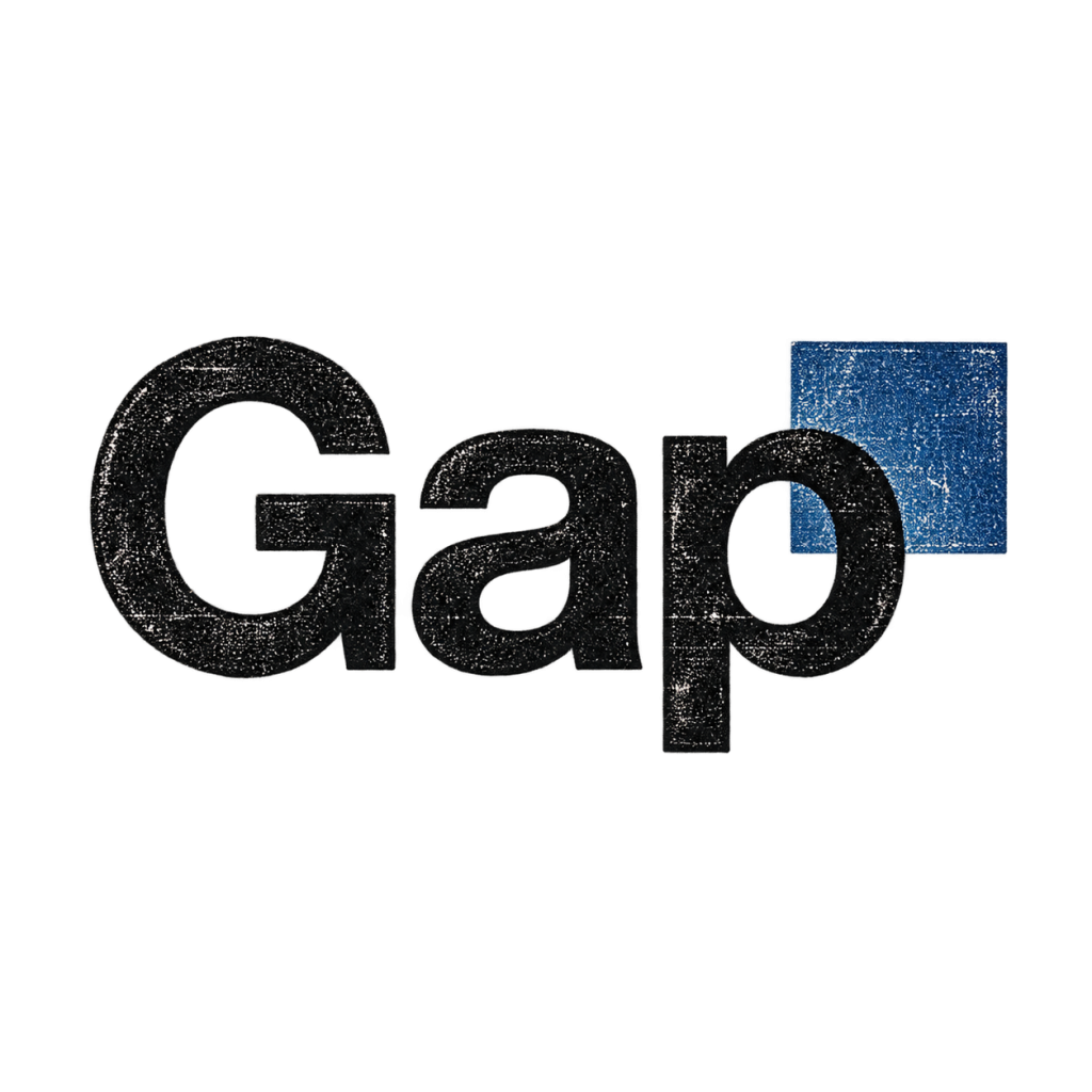
★ Featured Exhibit ★
Catalog record
440

The Gap Logo That Barely Made It a Week

We preserve disappointment.
It lasts longer.
The Gap Logo That Barely Made It a Week
440
Accession no.
440
Regret level
Gap replaced its instantly recognizable blue box, heard loud customer feedback, and restored the old logo within days.
Collection color
Blue

★ Curator’s Notes ★

In October 2010, Gap replaced its familiar blue-box logo with plain black lettering and a small blue square. Within days, the company said customer feedback had made support for the classic logo clear and restored it. Gap also admitted it had not handled the change the right way. One of the shortest public trials in brand redesign history.

Sources: Gap Inc. statement; Los Angeles Times.

Brand refresh completed its entire lifecycle between two shopping trips.