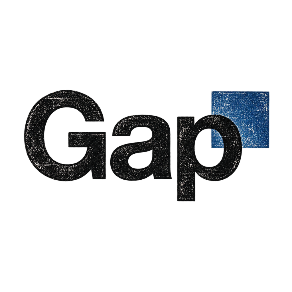
The Gap Logo That Barely Made It a Week
In October 2010, Gap replaced its familiar blue-box logo with plain black lettering and a small blue square. Within days, the company said customer…
View exhibit →Same company. New confusion. Five brand makeovers selected for the Museum’s wall of questionable judgment.
Then somebody scheduled a brand workshop. This collection looks at identity changes that made familiar companies harder to recognize, harder to understand, or harder to love.
Our five-file lineup starts with Gap and Qwikster. The remaining three exhibits are being prepared; their places below are reserved, not dead links.
The orange-juice carton identity crisis.
File in preparationA familiar electronics name tries on a new nickname.
File in preparationWhen a wildlife channel’s identity becomes a typography debate.
File in preparationIn October 2010, Gap replaced its familiar blue-box logo with plain black lettering and a small blue square. Within days, the company said customer…
View exhibit →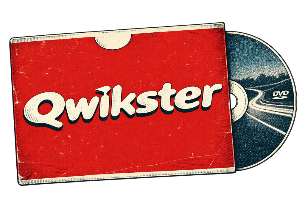
In 2011 Netflix announced a split: streaming would stay with Netflix, while DVD-by-mail would move to a new service called Qwikster, with separate accounts…
View exhibit →